Focused On Conversion.
SQUEEZE PAGE
DESIGN
Turning Visitors Into Leads
Squeeze pages are a powerful tool for capturing leads & driving conversions. Designed to quickly capture visitor information, such as email addresses, with the goal of converting them into leads or customers.
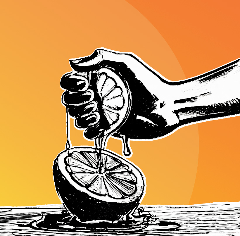
Focused On Conversion.
SQUEEZE PAGE DESIGN
Turning Visitors Into Leads
Squeeze pages are a powerful tool for capturing leads & driving conversions. Designed to quickly capture visitor information, such as email addresses, with the goal of converting them into leads or customers.
power re-marketing efforts,
get bookings, and increase longevity with Lead Generation Page Design
TYPES OF Lead Capture Pages
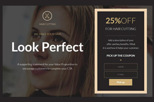
Discount or Promotion Squeeze Page
Geared towards offering discounts, coupons, or limited-time promotions in exchange for contact information, encouraging immediate action from visitors.
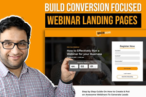
Webinar Registration Squeeze Page
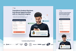
Lead Generation
Squeeze Page
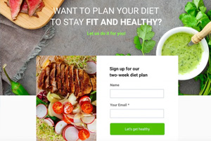
Product Launch
Squeeze Page
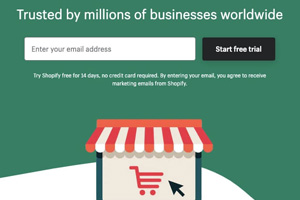
Free Trial or Demo
Squeeze Page
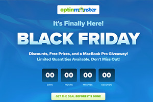
Contest or Giveaway
Squeeze Page
Get In Touch
About A squeeze page
Lead Capture Pages | Opt-In Pages | Conversion Pages | Sign-Up Pages | Email Collection Pages
Landing Pages | Subscriber Pages | Engagement Pages
WHY SQUEEZE PAGE DESIGN WORKS
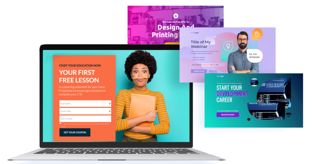
Strategic Setup: With the right approach and carefully chosen tools, building a high-performing squeeze page requires expertise and precision.
Focused Value: Squeeze pages provide a valuable free offer that grabs customer attention, encouraging them to share their email in exchange.
Now that you understand what squeeze page design is
let’s explore why it’s so effective.
Streamlined Design: The most effective squeeze pages are simple, with a single clear purpose—gathering contact information. This design keeps both you and the visitor focused on taking action.
High Conversion: Squeeze page templates make it easy to build pages that convert visitors into leads by clearly showcasing the offer's benefits.
Quick Engagement: Using a squeeze page wizard or pre-designed template lets you set up attention-grabbing pages in no time.
Purpose-Driven: Unlike general landing pages, squeeze pages are built specifically to collect emails, making them highly effective for list-building.
The Ultimate Conversion Channel
Email marketing consistently outperforms social media, with a 6x higher click-through rate than tweets and a 40x effectiveness in acquiring new customers compared to Facebook and Twitter.
It also leads in conversions, achieving a 66% rate from marketing messages, with 71% of people preferring email for promotional content over social media. With a remarkable ROI of 3,800%, email marketing is the top channel for driving conversions.
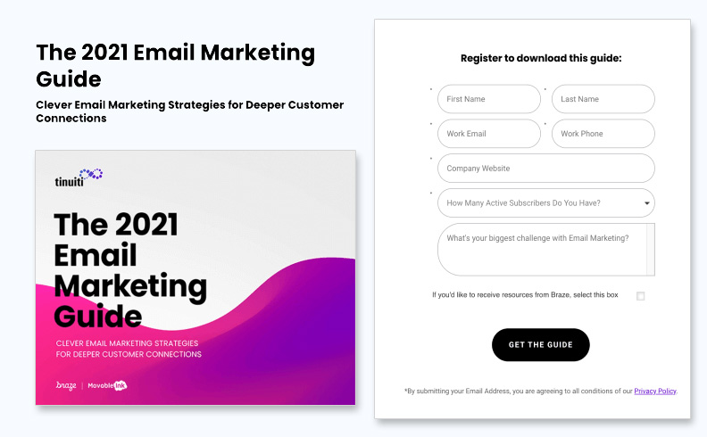
Image source: tinuiti’s free guide on email marketing
SQUEEZE PAGE KEY ELEMENTS
A squeeze page is made up of several essential elements to capture leads effectively:
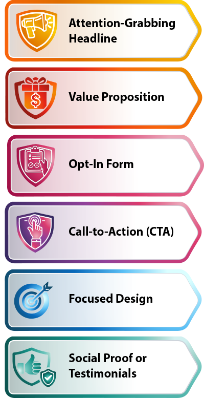
Attention-Grabbing Headline: This draws readers in and communicates the value of the offer clearly. It should be both direct and appealing.
Value Proposition: A short description of what’s being offered for free, emphasizing its benefits and why it’s valuable to the visitor.
Opt-In Form: A straightforward form requesting a name and email address. This form is the page's main feature and should be quick and easy to complete.
Call-to-Action (CTA): A prominent button or link that encourages visitors to submit information. The CTA uses active language like “Get It Now” or “Download Free Guide.”
Focused Design: The page minimizes distractions to keep attention on the offer, typically without navigation links or elements that could lead visitors away from the opt-in form.
Social Proof or Testimonials: Sometimes, testimonials or social proof are included to build trust and motivate visitors to take action.
SQUEEZE PAGE KEY ELEMENTS
A squeeze page is made up of several essential elements to capture leads effectively:

Attention-Grabbing Headline: This draws readers in and communicates the value of the offer clearly. It should be both direct and appealing.

Value Proposition: A short description of what’s being offered for free, emphasizing its benefits and why it’s valuable to the visitor.

Opt-In Form: A straightforward form requesting a name and email address. This form is the page's main feature and should be quick and easy to complete.

Call-to-Action (CTA): A prominent button or link that encourages visitors to submit information. The CTA uses active language like “Get It Now” or “Download Free Guide.”

Focused Design: The page minimizes distractions to keep attention on the offer, typically without navigation links or elements that could lead visitors away from the opt-in form.

