Focused On Conversion.
SQUEEZE PAGE
WEB DESIGN
Squeeze pages are a powerful tool for capturing leads & driving conversions. Designed to quickly capture visitor information, such as email addresses, with the goal of converting them into leads or customers.
Focused On Conversion.
SQUEEZE PAGE
WEB DESIGN
Squeeze pages are a powerful tool for capturing leads & driving conversions. Designed to quickly capture visitor information, such as email addresses, with the goal of converting them into leads or customers.
power re-marketing efforts,
get bookings, and increase longevity.
TYPES OF Lead Capture Pages
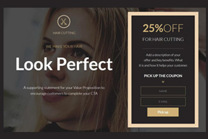
Discount or Promotion Squeeze Page
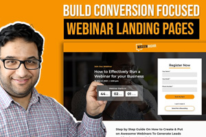
Webinar Registration Squeeze Page
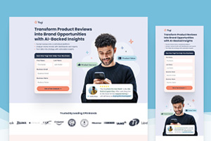
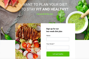
Lead Generation
Squeeze Page
Product Launch
Squeeze Page
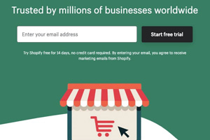
Free Trial or Demo
Squeeze Page
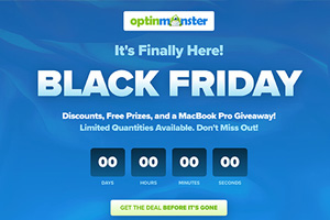
Contest or Giveaway
Squeeze Page
Get In Touch
About A squeeze page
Lead Capture Pages | Opt-In Pages | Conversion Pages | Sign-Up Pages | Email Collection Pages
Landing Pages | Subscriber Pages | Engagement Pages
WHY SQUEEZE PAGES WORK
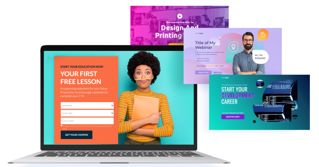
Strategic Setup: With the right approach and carefully chosen tools, building a high-performing squeeze page requires expertise and precision.
Focused Value: Squeeze pages provide a valuable free offer that grabs customer attention, encouraging them to share their email in exchange.
Now that you understand what a squeeze page is
let’s explore why it’s so effective.
Streamlined Design: The most effective squeeze pages are simple, with a single clear purpose—gathering contact information. This design keeps both you and the visitor focused on taking action.
High Conversion: Squeeze page templates make it easy to build pages that convert visitors into leads by clearly showcasing the offer's benefits.
Quick Engagement: Using a squeeze page wizard or pre-designed template lets you set up attention-grabbing pages in no time.
Purpose-Driven: Unlike general landing pages, squeeze pages are built specifically to collect emails, making them highly effective for list-building.
The Ultimate Conversion Channel
Email marketing consistently outperforms social media, with a 6x higher click-through rate than tweets and a 40x effectiveness in acquiring new customers compared to Facebook and Twitter.
It also leads in conversions, achieving a 66% rate from marketing messages, with 71% of people preferring email for promotional content over social media. With a remarkable ROI of 3,800%, email marketing is the top channel for driving conversions.
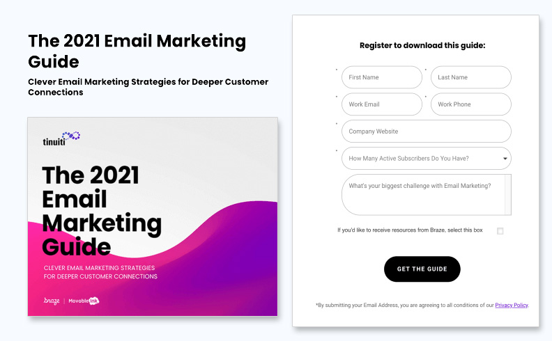
Image source: tinuiti’s free guide on email marketing
SQUEEZE PAGE KEY ELEMENTS
A squeeze page is made up of several essential elements to capture leads effectively:
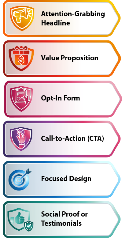
Attention-Grabbing Headline: This draws readers in and communicates the value of the offer clearly. It should be both direct and appealing.
Value Proposition: A short description of what’s being offered for free, emphasizing its benefits and why it’s valuable to the visitor.
Opt-In Form: A straightforward form requesting a name and email address. This form is the page's main feature and should be quick and easy to complete.
Call-to-Action (CTA): A prominent button or link that encourages visitors to submit information. The CTA uses active language like “Get It Now” or “Download Free Guide.”
Focused Design: The page minimizes distractions to keep attention on the offer, typically without navigation links or elements that could lead visitors away from the opt-in form.
Social Proof or Testimonials: Sometimes, testimonials or social proof are included to build trust and motivate visitors to take action.
SQUEEZE PAGE KEY ELEMENTS
A squeeze page is made up of several essential elements to capture leads effectively:

Attention-Grabbing Headline: This draws readers in and communicates the value of the offer clearly. It should be both direct and appealing.

Value Proposition: A short description of what’s being offered for free, emphasizing its benefits and why it’s valuable to the visitor.

Opt-In Form: A straightforward form requesting a name and email address. This form is the page's main feature and should be quick and easy to complete.

Call-to-Action (CTA): A prominent button or link that encourages visitors to submit information. The CTA uses active language like “Get It Now” or “Download Free Guide.”

Focused Design: The page minimizes distractions to keep attention on the offer, typically without navigation links or elements that could lead visitors away from the opt-in form.

Social Proof or Testimonials: Sometimes, testimonials or social proof are included to build trust and motivate visitors to take action.
SQUEEZE PAGES DONE RIGHT
To accelerate business growth, especially when offering a high-ticket product or service, generating high-quality leads is essential.
A key component of any lead generation strategy is the landing page, which is crafted to convert leads effectively. The squeeze page serves as a powerful enhancer within this funnel.
Four Effective Lead Collection Squeeze Page Examples
- The recognizable photo of Zach Galifianakis serves as an authority badge of sorts, associating GQ with powerful celebrities.
- The ultra-short form only asks prospects for one piece of personal information: email.
- The CTA button color contrasts the white page well.
- The word “free” is the first thing you see on this squeeze page.
- Company badges associate Smart Insights with well-known brands like Unicef, Vodafone, HP, and Canon.
- Testimonials from real marketers boost trust. Though, it would be better if they had some pictures next to them.
- The short form only asks for email address, not even name or company.
- The bulleted copy quickly covers what you’ll receive by downloading the templates.
- The copy is filled with persuasive words like “Exclusive,” “Secrets,” “Premium,” “Richer,” and “Free.”
- The button copy is written in first person.
- The content is short but informative. Users know exactly what they’re going to get when they enter their email address to download a copy.
- The button color isn’t bold or bright like the other squeeze pages we’ve already discussed. However, it contrasts the rest of the page. Contrast is always more important than color.
- The headline is benefit-oriented, explaining to the prospect that they can save millions by reading “Seven Tips For Disaster Recovery.”
- The copy is concise, but informational. We know exactly what we’re going to get by downloading.
- The form only asks for email and country. The less fields you include, and the less personal they are, the more likely it is that your prospect will fill them out.
- The opt-in box isn’t already checked unlike many squeeze pages. By letting users opt in instead of unchecking the box to opt out, you’re passively increasing the quality of email subscribers you generate using this form.
